Reveal day is finally here! At long last, we are ready to unveil our main bathroom renovation. It feels like it’s been a long time coming. Although when I really stop to think about it, we only started this part of our reno in December. So realistically, I know I should cut us a bit of slack. It’s always the frustrating little details at the end of a project that seem to drag on and take forever.
Over this past weekend, we were finally able to hang one of the last finishing touches. Our new window valance is up and things are looking a little more polished in the space. I still have a linen cabinet on order to hang in the niche above our bench, but other than that we have pretty well checked everything off the to-do list for this room.
When we were planning our main bathroom renovation, we wanted a fresh look with modern finishes. Throw in a touch of farmhouse charm for good measure and voila! Adding a couple natural, rustic touches grounds the space and adds a bit of warmth to the decor.
Walls
We chose to keep things pretty neutral in the bathroom, going with a grey colour palette. Finding the right grey can be tricky (see my post on How to Pick the Perfect Grey). We definitely sampled a few along the way. In the end we selected CIL Pebble Grey. It’s a great paint colour, a true grey without any purple or blue undertones. It’s important though, to always consider your lighting temperature (both natural and artificial) when selecting a paint colour as it can significantly change the feel of the colour you pick.
Vanity
We ordered a medium brown vanity for the bathroom, to play off the bead boarding detail that we were installing on the walls. The vanity came paired with a lovely Carrera marble countertop and undermounted sinks. The two together coordinated perfectly to create a nice contrast to the rest of the bathroom. The vanity set is from Costco, the 73″ Langley double vanity. (Check out a similar vanity by clicking here). It is complimented by a set of widespread faucets Pfister in Tuscan Bronze.
Floors
I really like the look of wood-look ceramic tiles. I think they add a natural element to the room and help to ground the space. The 70/30 bricklay pattern we chose not only makes for a better installation, but I really like the subtle detail it adds to the decor.
Lights
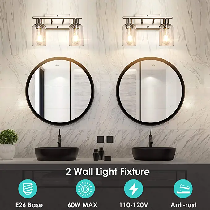
When shopping for bathroom lights, we tried to keep our desire for some farmhouse charm in mind. After many hours of online shopping, we choose these metal shade yard light style fixtures for above the vanity. They were a great buy, check out the Langdon Mills 2-Light Putnam vanity light.
Extras
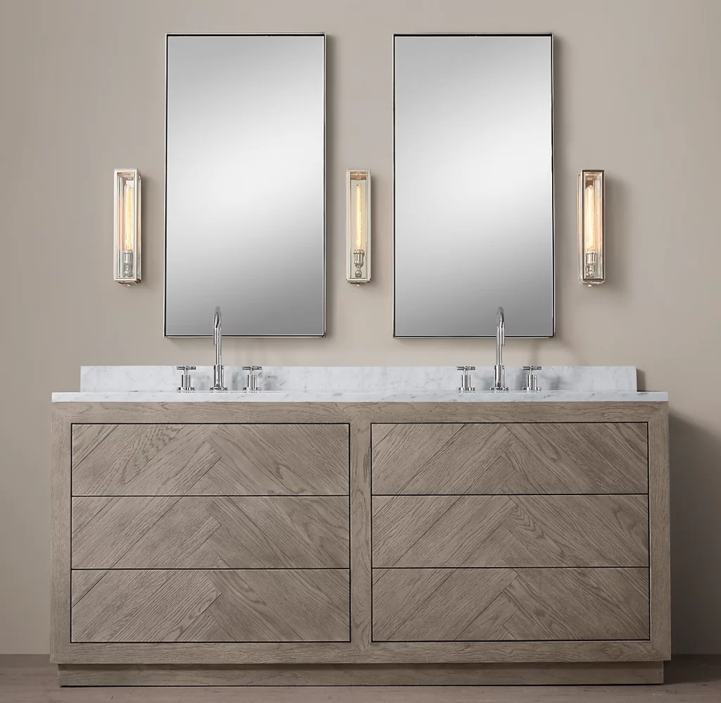
We wanted our main bathroom renovation to have a calm, relaxed feel with a touch of refined luxury. It is our kids bathroom after all, so we have to think as much about durability as we do beauty. Glass tiles and stone countertops were a great start, but they are a bit stark on their own. So we added the natural textures of the wood bench and softened the room with a fabric shower curtain and padded window valance.
Are you thinking of renovating? Leave me a comment below and let me know what you’re working on!
For more design inspiration, follow me on Pinterest!
LET’S STAY CONNECTED I agree to have my personal information transfered to MailChimp ( more information ) Never miss another post! Subscribe to receive new posts and design advice straight to your in-box. Your email address will not be sold or shared with anyone else.
Would love to know what flooring you used in the bathroom. I love it.