Subway tiles are a design classic. I’m pretty sure that practically every interior designer out there has installed them somewhere at some point. And why not? Subway tiles are a super simple, often inexpensive way to finish off almost any space in your home. Kitchens, bathrooms, laundry rooms…they all have great potential for subway tile installation. Subway tiles are so versatile and stylish, plus they are now available in a multitude of sizes and materials.
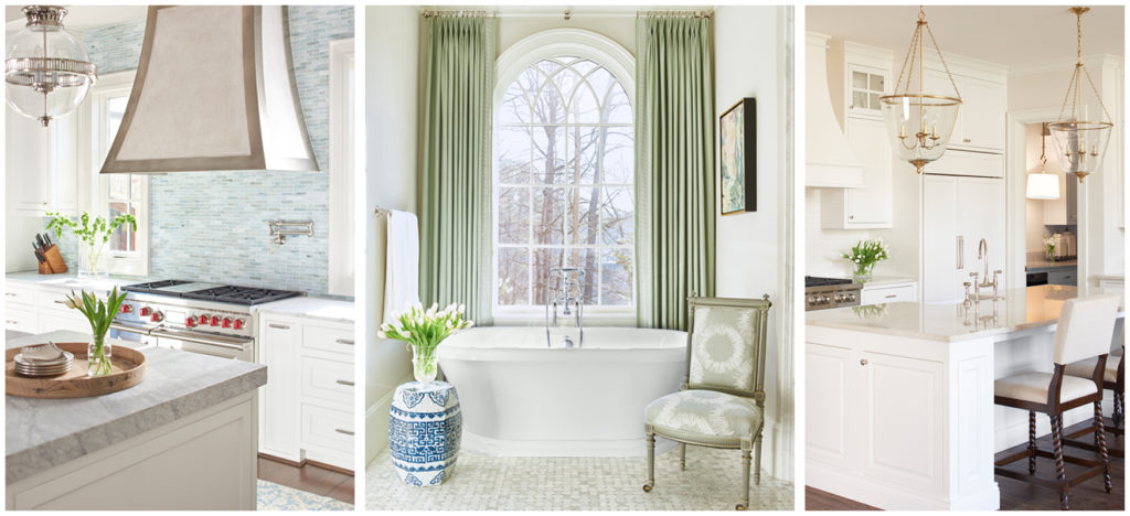
via L. Kae Interiors
I love the simplicity of subway tiles, but that doesn’t mean they have to be boring! We shopped and shopped all sorts of local tile stores for the perfect backsplash option for our kitchen renovation. (Click here to see some of our kitchen organization ideas). We wanted to find something that was beautiful but classic. A tile that was simple by design but had just enough detail that we wouldn’t grow tired of it too quickly. In the end though, we ended up coming back to the classic beauty of subway tiles.
Subway Tiles via Amazon
So what is it that keeps subway tiles from going out of style anyways? How can you use this timeless tile option in your home to refresh your space? Well, I think it boils down to the multitude of clever ways that people have devised for installing them. Here are 10 stylish ways to use subway tiles as your next backsplash selection.
1. Straighlay
This can be either horizontal or vertical, straightlay creates a focus on straight, linear details.
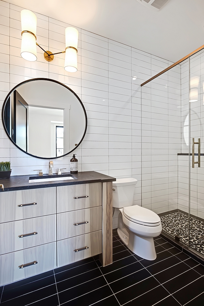
via Home Bunch
2. Diagonal
Here the pattern creates a 45 degree affect. The diagonal pattern is nicely offset from row to row.
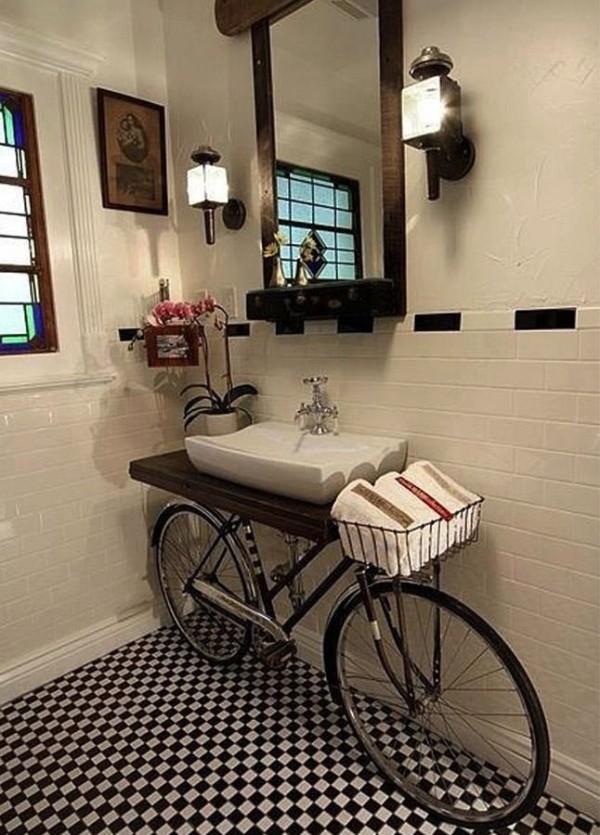
via Home Designing
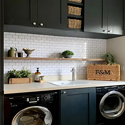
3. Horizontal Bricklay
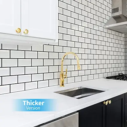
This is definitely the most traditional installation for subway tiles. Horizontal bricklay dates back to the introduction of subway tiles in the early 1900s in New York city’s subway stations. This traditional installation can have a whole new look though when a larger or longer tile is selected.
Horizontal Bricklay via Amazon
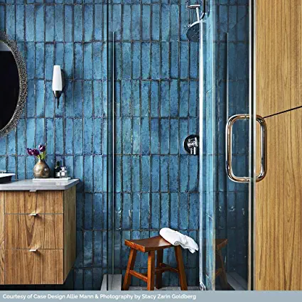
4. Vertical Bricklay
A twist on the traditional horizontal bricklay, vertical tile installation gives a modern look to your space.
Subway Tiles via Amazon
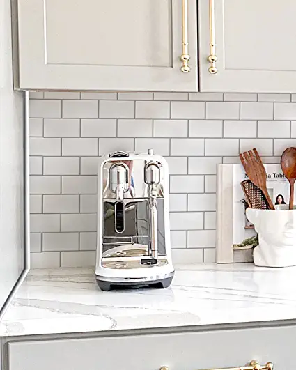
5. Offset or 70/30
Another variation to the 50/50 bricklay, this look is particularly nice with longer more rectangular tiles.
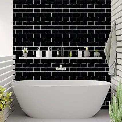
Subway Tiles via Amazon
6. Herringbone
This pattern has a distinct V-shaped weaving affect which resembles a broken zigzag. A traditional wall tile herringbone pattern has the break or reversal in a vertical line from the floor. Turning the pattern slightly creates an entirely different affect, keeping the tiles parallel and perpendicular to the floor. (Click here to see more reasons to love Herringbone!)
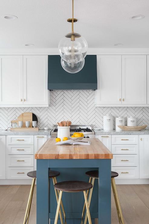
Traditional Herringbone via Decor Pad
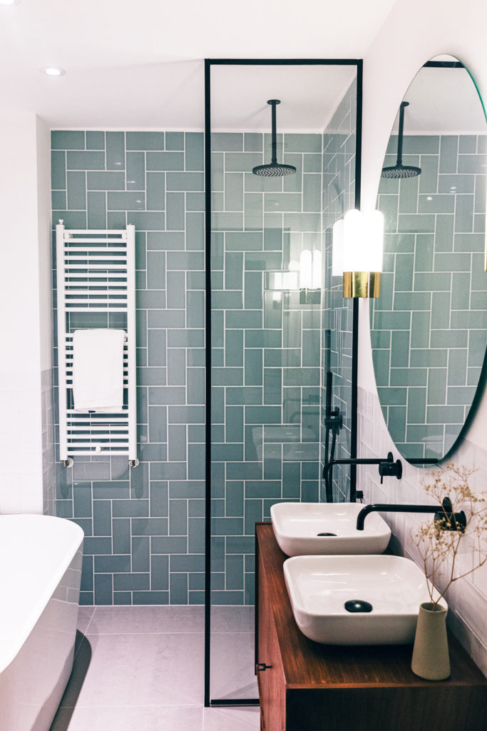
Vertical Herringbone via dec.amsterdam
7. Crosshatch or Basket-weave
Both of these patterns take inspiration from the more commonly seen herringbone. They each have a bit of a modern feel and add a touch of the unexpected to your space.
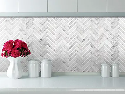
Crosshatch via Amazon
8. Add an Insert
The possibilities here are literally endless. Whether you combine two installation styles or two different tiles, you are limited only by your imagination.

9. Combine Finishes and Colours
A fresh idea for tile installation has been to combine more than one at a time to give the appearance of changing from one to another across the room or wall. Combining colours or finishes can give the bold appearance of stripes or can change more organically from one into another.
Subway Tiles via Amazon
10. Mix and Match
Perhaps the boldest and most innovative design idea of all is to combine two or more of the options above. This will definitely create a one-of-a-kind look and give your subway tiles a style boost.
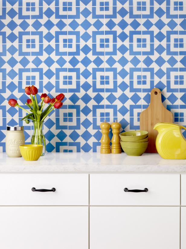
via HGTV
For more great design inspiration, follow me on Pinterest!
LET’S STAY CONNECTED I agree to have my personal information transfered to MailChimp ( more information ) Never miss another post! Subscribe to receive new posts and design advice straight to your in-box. Your email address will not be sold or shared with anyone else.
