Video credit: NISH via YouTube.
There is something about modern farmhouse paint colors that makes a house feel instantly more welcoming.
Maybe it’s the soft white walls, the warm greige, the dusty blue, or that gentle green that somehow makes a room feel like it has been there forever—even when the drywall is brand new.
Modern farmhouse style works because it mixes old and new without making the room feel confused. You get the warmth of farmhouse design, but with cleaner lines and a fresher color palette.
The original One Plus Two Design Co. article focused on five favorite Sherwin-Williams choices: Eider White, Mindful Gray, Intellectual Gray, Sea Salt, and Hinting Blue. The discussion also points out something that anyone who has ever stood in front of a wall of paint chips already knows: lighting and personal preference can dramatically change how a color looks in a room.
So rather than simply picking a paint color because it looked gorgeous in a photo, let’s look at what these shades actually bring to a modern farmhouse home—and how to use them without ending up with a room that feels either too cold or too country.
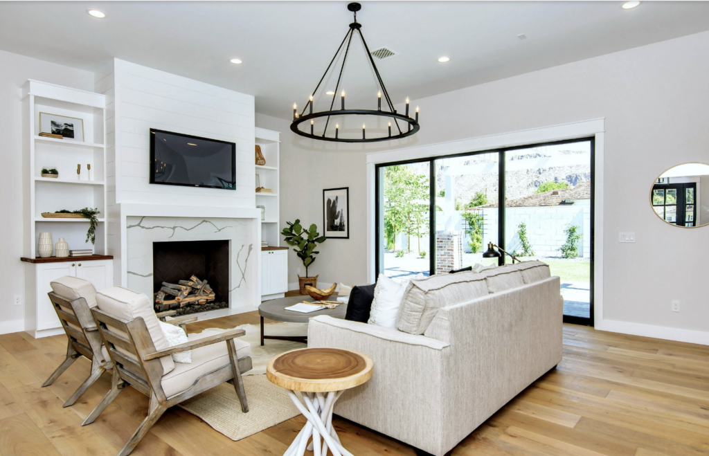
What Makes a Modern Farmhouse Paint Color Different?
Modern farmhouse colors are generally soft, livable, and easy to combine with natural materials.
Think about the elements that usually appear in this style:
- Natural wood floors
- Shiplap or wall paneling
- Black metal accents
- White or cream cabinets
- Linen and cotton fabrics
- Woven baskets
- Stone and ceramic textures
- Simple, comfortable furniture
The paint needs to work with all of them.
That is why the best modern farmhouse wall colors are rarely loud. They create a backdrop rather than demanding all the attention.
Benjamin Moore’s current modern farmhouse collection similarly highlights soft neutrals, earthy colors, whites, grays, greens and deeper accents as a foundation for the style.
The Best Modern Farmhouse Paint Colors at a Glance
| Paint Color | Color Code | Best Use | Overall Feel |
|---|---|---|---|
| Eider White | SW 7014 | Walls, bedrooms, living rooms | Soft and bright |
| Mindful Gray | SW 7016 | Walls and cabinetry | Warm and cozy |
| Intellectual Gray | SW 7045 | Cabinets and deeper accents | Grounded and elegant |
| Sea Salt | SW 6204 | Bedrooms, bathrooms, kitchens | Soft and soothing |
| Hinting Blue | SW 6519 | Bedrooms, living rooms, accents | Light and airy |
1. Eider White SW 7014: The Soft Modern Farmhouse White
Eider White is a great example of why modern farmhouse white paint does not have to be stark.
The original article describes it as an off-white with a touch of gray that keeps it from feeling too sharp or clinical. It is positioned as a bright, fresh choice for spaces such as living rooms and bedrooms.
That makes Eider White a particularly useful choice when you want the room to feel light but don’t want the walls screaming, “I have chosen the whitest white known to humanity.”
It works beautifully with:
- Warm wood floors
- Black window frames
- Natural linen
- Light oak furniture
- Soft beige rugs
- White trim
The modern farmhouse look often depends on contrast, and a soft white wall provides an excellent foundation for darker furniture and natural textures.
For another look at Eider White in a real room, see this Sherwin-Williams Eider White color page.
Best Rooms for Eider White
Try it in living rooms, bedrooms, hallways, open-plan spaces, and anywhere you want a clean but comfortable backdrop.
It can also be a good option when you have dark flooring or heavy wood furniture that you don’t want the walls competing with.
2. Mindful Gray SW 7016: Warm, Cozy and Surprisingly Flexible
Now we move into one of the most useful modern farmhouse gray paint colors: Mindful Gray SW 7016.
The original One Plus Two Design Co. post describes Mindful Gray as a warmer gray with taupe or brown undertones. That warmth helps keep it from feeling cold.
This is important because not all gray paint behaves the same way.
Two gray walls can look completely different once daylight, flooring, furniture, and artificial light enter the picture.
Mindful Gray is especially interesting in kitchens and cabinetry because it can add depth without becoming overwhelmingly dark.

The example above shows exactly why warm gray works so well with farmhouse materials. The painted cabinetry provides a soft background while stainless appliances, wood flooring, white tile and simple lighting add contrast.
Where Mindful Gray Works Best
- Kitchen cabinets
- Kitchen islands
- Living rooms
- Dining rooms
- Bedrooms
- Built-ins
It is also a strong choice for a whole-house neutral paint palette when you want something warmer than a cool gray.
3. Intellectual Gray SW 7045: A Deeper Neutral with Personality
Intellectual Gray SW 7045 gives you a little more depth.
The original article describes it as a cool-family gray that works unusually well as a neutral and notes that it was used on kitchen island cabinetry.
Current Sherwin-Williams information describes Intellectual Gray as a gentle warm gray and pairs it with creamy whites such as Shoji White.
That makes it interesting for homeowners who want a modern farmhouse palette but don’t want every surface painted white.
Use a deeper gray on an island, vanity, built-in shelving, or selected interior doors while keeping the walls lighter.
The result can add dimension without making the room feel heavy.
A Simple Way to Use Intellectual Gray
Try a light wall color with Intellectual Gray cabinetry.
Then add natural wood and a warm metal such as aged brass.
Suddenly the kitchen looks layered instead of flat.
4. Sea Salt SW 6204: The Green-Gray Farmhouse Favorite
If you’re nervous about green paint, Sea Salt may change your mind.
The original article admits that green isn’t necessarily the author’s favorite color, but describes Sea Salt as a soft greenish shade with enough gray to feel vintage rather than minty or overly earthy.
That combination is exactly why Sea Salt has become such a familiar recommendation for bathrooms, bedrooms, kitchens, laundry rooms, and calming spaces.
Lighting matters enormously here.
The original article warns that warm lighting or strong southern exposure can make Sea Salt appear greener.
That doesn’t make it a bad choice.
It simply means you need to understand how the room interacts with the paint.
Current Sherwin-Williams guidance also lists Sea Salt SW 6204 as a popular color choice, while the visual appearance can vary with lighting.
For current manufacturer information, see the Sherwin-Williams Sea Salt color information.
Where Sea Salt Looks Fantastic
- Bathrooms
- Bedrooms
- Kitchen cabinetry
- Laundry rooms
- Dining rooms
- Accent walls
It pairs especially well with white trim, light wood, woven textures and natural greenery.
5. Hinting Blue SW 6519: A Quiet Splash of Color
Modern farmhouse design doesn’t have to be all white and gray.
Sometimes a little blue is exactly what the room needs.
Hinting Blue SW 6519 is described in the original article as a light blue that adds color without overpowering a room.
That’s a useful distinction.
You aren’t trying to make the room look like a tropical vacation rental.
You’re simply adding a little color to a neutral palette.
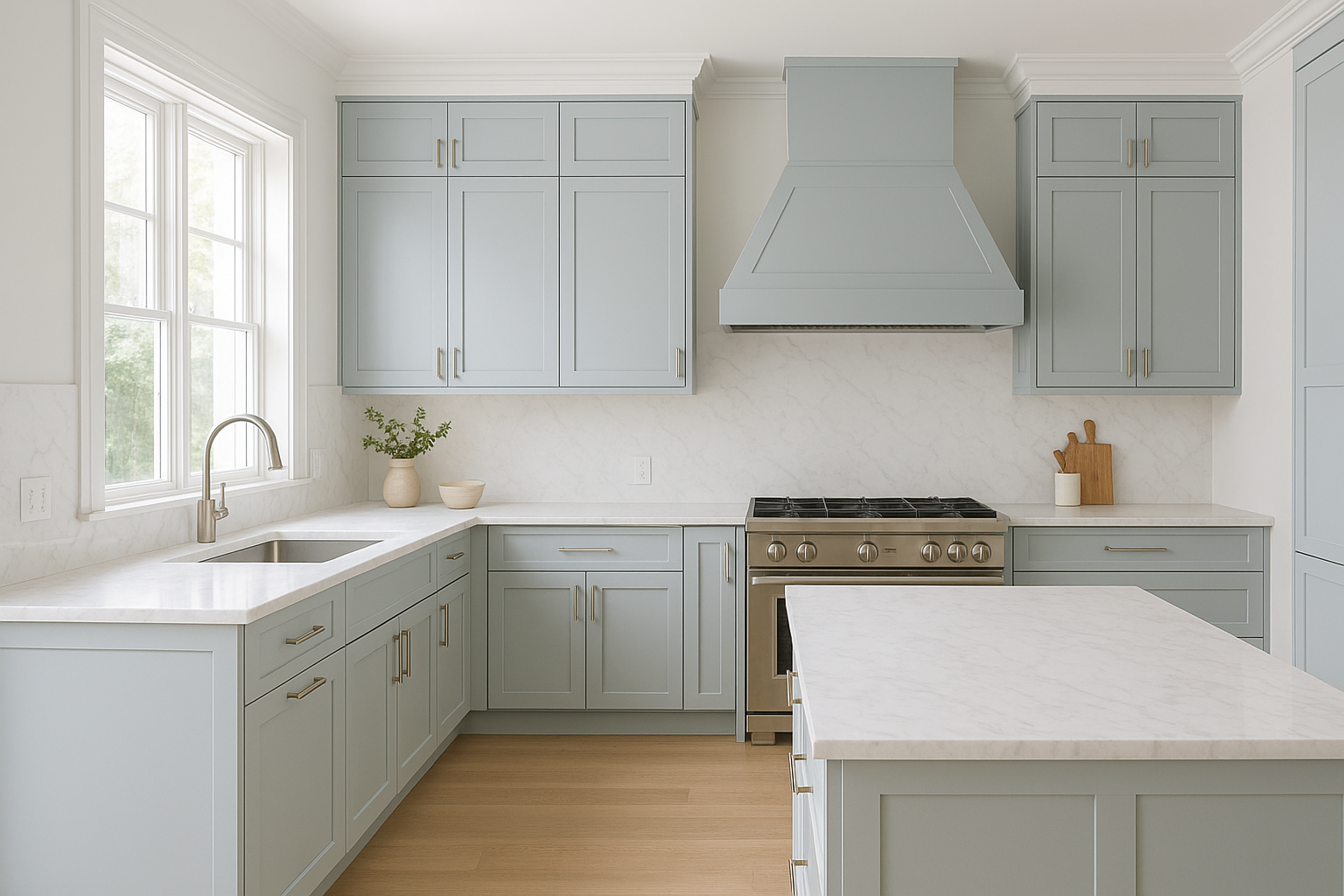
The example above shows how a pale blue-gray cabinet color can work with white countertops, light wood flooring, and simple brass hardware.
That is modern farmhouse at its best: relaxed, bright, and comfortable.
Best Rooms for Hinting Blue
- Bedrooms
- Living rooms
- Bathrooms
- Kitchen cabinets
- Home offices
How to Choose Between These Five Modern Farmhouse Colors
Here’s where things get easier.
Don’t start by asking, “Which color is the prettiest?”
Ask what your room needs.
Want a Bright, Soft Neutral?
Start with Eider White.
Want Warmth Without Beige?
Look at Mindful Gray.
Want More Depth?
Consider Intellectual Gray.
Want a Soft Green-Gray?
Try Sea Salt.
Want Gentle Color?
Consider Hinting Blue.
Suddenly the giant wall of paint chips looks slightly less terrifying.
Why Lighting Can Completely Change Farmhouse Paint Colors
This is one of the most important lessons in the original article.
A paint color doesn’t live alone on a wall.
It reacts to the light around it.
Morning light can look different from afternoon light.
Natural daylight is different from warm LED bulbs.
North-facing rooms can feel cooler, while rooms with strong southern exposure can appear warmer.
That means a color that looks beautifully neutral in the paint store may suddenly look slightly blue, beige, green, or taupe at home.
And yes, this is the exact moment homeowners begin asking the paint can whether it is playing a prank on them.
Never Choose a Farmhouse Paint Color from a Tiny Swatch
The tiny paint card is useful for narrowing down options.
It is not a guarantee of what your entire wall will look like.
A much better method is to use a large sample.
Paint a large poster board or sample several sections of the wall.
Then move your sample around.
Look at it near the window.
Look at it near the floor.
Look at it near the cabinets.
Then check it again at night.
For more detailed paint-selection advice, visit How to Pick the Perfect Grey Paint.
Warm Gray vs. Cool Gray in Modern Farmhouse Design
Understanding undertones will save you from a lot of frustration.
Warm grays often contain subtle brown, beige, or taupe influences.
Cool grays may pull more blue or green.
Neither is automatically better.
The question is whether the undertone works with the rest of your room.
For example, warm wood floors often work beautifully with a warm gray because the colors feel connected.
A cooler gray can create stronger contrast when paired with warmer materials.
If you’re deciding between the two, our warm gray paint guide and cool gray paint guide can help you compare the different directions.
How to Pair Modern Farmhouse Paint with Wood
Wood is practically the best friend of farmhouse paint.
Light oak can keep the room bright.
Medium wood adds warmth.
Dark walnut can create drama.
Reclaimed wood can make the space feel more rustic.
The right gray, white, blue, or green can help connect all of those finishes.
For example:
- Eider White + light oak = bright and airy
- Mindful Gray + medium wood = warm and grounded
- Intellectual Gray + white cabinets = contrast and depth
- Sea Salt + pale wood = relaxed and coastal farmhouse
- Hinting Blue + warm wood = soft and welcoming
Modern Farmhouse Paint Colors for Kitchens
The kitchen is probably where these colors shine the most.
Modern farmhouse kitchens typically have plenty of texture: wood, stone, tile, hardware, countertops, lighting, and cabinetry.
That makes neutral paint particularly valuable.
A soft wall color can hold everything together without competing with the details.
For Kitchen Walls
Eider White and lighter neutrals can keep the kitchen feeling bright.
For Cabinets
Mindful Gray, Intellectual Gray, and Sea Salt can create much more visual depth.
For an Island
A darker gray can make the island feel like a deliberate focal point instead of simply another cabinet box.
Our Silgranit sink design guide also shows how kitchen finishes such as sinks, countertops, and cabinetry need to work together as one visual composition.
Modern Farmhouse Paint Colors for Bedrooms
Bedrooms are where softer shades really get a chance to shine.
If you’re creating a cozy farmhouse bedroom, consider:
- Eider White for a soft neutral backdrop
- Mindful Gray for cozy warmth
- Sea Salt for a soothing green-gray
- Hinting Blue for a calm color accent
Keep the bedding natural and layered.
Add linen.
Bring in wood.
Then let the wall color quietly support the rest of the room.
For additional bedroom inspiration, explore modern master bedroom décor ideas.
Modern Farmhouse Paint Colors for Bathrooms
Bathrooms are another place where these gentle colors can perform beautifully.
Sea Salt can create a soft spa-like feeling.
Eider White can keep a small bathroom feeling bright.
Mindful Gray can add warmth around white tile and natural wood.
Hinting Blue can introduce just enough color to make a small room memorable.
If you are creating a transitional farmhouse bathroom, think about combining neutral wall colors with simple fixtures and natural textures.
Modern Farmhouse Paint Colors for Living Rooms
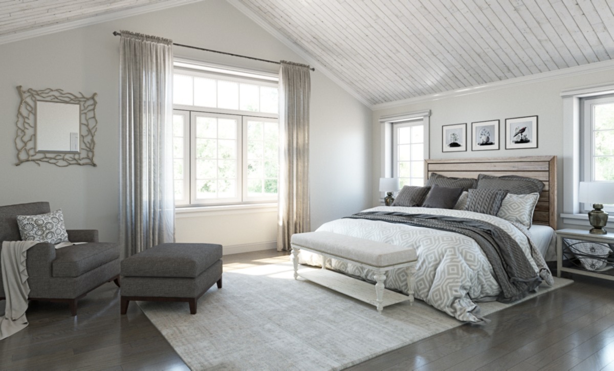
Living rooms benefit from paint colors that are easy to live with.
You don’t want the walls becoming the loudest thing in the room.
Instead, use paint to create a backdrop for furniture, artwork, rugs, and lighting.
Eider White works well when you want brightness.
Mindful Gray works when you want more warmth.
Sea Salt can add a little personality without becoming overwhelming.
Hinting Blue is a nice choice when the room needs a gentle color note.
Modern Farmhouse Paint Colors for Cabinets
Painted cabinetry is one of the easiest ways to introduce farmhouse character.
And you don’t necessarily need to paint every cabinet the same shade.
Two-tone kitchens can look fantastic.
For example, try light perimeter cabinets with a deeper gray island.
Or pair warm gray lower cabinets with soft white uppers.
For more inspiration, see our guide to choosing the right gray before committing to a cabinet color.
How to Create a Whole-House Modern Farmhouse Color Palette
Here’s a strategy that can make an open-plan house feel much more connected.
Choose one primary neutral.
Then choose two or three supporting colors.
For example:
- Main walls: Eider White
- Secondary walls or cabinetry: Mindful Gray
- Bathroom or bedroom accent: Sea Salt
- Small accent areas: Hinting Blue
- Dark contrast: Black or deep charcoal
This creates variation without making every room feel like a completely different house.
For more color-planning inspiration, see our paint color selection guide.
The 70-20-10 Rule for Modern Farmhouse Colors
One useful approach is the classic 70-20-10 color rule.
Roughly 70% of the room uses the primary color, 20% comes from a secondary color, and 10% becomes an accent.
You don’t have to follow these percentages with a ruler.
The idea is simply to prevent every color from fighting for first place.
For example, a farmhouse living room might use:
- 70% soft white or greige
- 20% natural wood and secondary neutrals
- 10% muted blue, green, or black accents
It’s a simple framework, but it can save a room from becoming visually chaotic.
Should Trim Be White in a Modern Farmhouse Home?
Often, yes.
White trim creates clean definition around softer wall colors.
However, “white” doesn’t have to mean the brightest white available.
The right trim color should work with the wall undertone.
A warm wall color can pair beautifully with a soft creamy trim, while a cooler palette may benefit from a cleaner white.
Always test the combination in your own lighting.
How Hardware Changes the Paint Color
Hardware can completely change how a paint color feels.
Black hardware creates contrast.
Brass adds warmth.
Brushed nickel creates a quieter, more contemporary look.
Wood pulls the palette toward rustic warmth.
That’s why it is a mistake to evaluate paint color while looking only at an empty wall.
Put the paint sample next to your cabinets, flooring, countertop, handles, and lighting.
That’s when you’ll see whether the entire room makes sense.
Common Modern Farmhouse Paint Mistakes
Choosing a Color Only Because It Is Trending
A color can be popular and still be wrong for your room.
Ignoring Natural Light
Light changes color dramatically. Always test the shade in your actual space.
Skipping Large Samples
A tiny paint card cannot tell you how an entire room will feel.
Forgetting Existing Finishes
Your flooring, countertops, cabinets, and furniture all influence the final appearance.
Using Too Many Accent Colors
Farmhouse style usually benefits from restraint.
Painting Everything the Same White
White-on-white can be beautiful, but contrast and subtle color can make the room feel much more layered.
How to Test Modern Farmhouse Paint Colors Correctly
Follow this simple process:
- Choose three to five possible colors.
- Get physical paint samples.
- Paint large sample boards.
- Move them around the room.
- Check them in daylight.
- Check them under artificial lighting.
- Compare them with flooring and furniture.
- Live with the samples for at least a full day.
- Choose the shade that looks best most of the time.
This process is especially important with gray, greige, green-gray, and blue-gray colors because their undertones can become much more obvious as lighting changes.
For an even deeper look at gray paint selection, explore 10 Best Cool Grey Paint Colours and 10 Warm Grey Paint Colors.
Modern Farmhouse Paint Colors That Pair Well with Natural Materials
Modern farmhouse design is all about texture.
Paint should make those textures look better.
Try combining soft farmhouse paint with:
- Oak flooring
- Reclaimed wood
- Natural stone
- Woven rugs
- Linen curtains
- Rattan baskets
- Black metal fixtures
- Ceramic accessories
The paint doesn’t need to imitate wood or stone.
It simply needs to sit comfortably beside them.
Modern Farmhouse Paint Colors for Exterior Use
The same color philosophy can work outdoors, but exterior light changes everything.
Soft whites and muted neutrals are often used on modern farmhouse exteriors because they create a clean, timeless appearance.
Dark charcoal and black can work beautifully for shutters, doors, trim, or other accents.
Muted greens and blues can also add personality without overpowering the architecture.
Benjamin Moore’s modern farmhouse collection includes exterior-friendly options and emphasizes whites, grays, greens, and deeper accents for the look.
Can Modern Farmhouse Style Use Bold Colors?
Absolutely.
Modern farmhouse doesn’t mean “everything must be beige.”
A dark door, a muted navy island, a green vanity, or a charcoal accent wall can add personality.
The key is balance.
Use one strong element instead of turning every surface into a different statement.
That’s what keeps the room modern rather than chaotic.
A Simple Modern Farmhouse Palette You Can Copy
Want an easy starting point?
Try this combination:
- Walls: Eider White
- Cabinetry: Mindful Gray
- Accent color: Sea Salt
- Small accent: Hinting Blue
- Hardware: Matte black or warm brass
- Wood: Light to medium natural oak
This creates a palette that feels warm, relaxed, and flexible without becoming overly rustic.
Frequently Asked Questions About Modern Farmhouse Paint Colors
What are the best modern farmhouse paint colors?
Popular choices include soft whites, warm grays, greiges, muted blue-greens, and gentle blues. The original One Plus Two Design Co. article highlights Eider White, Mindful Gray, Intellectual Gray, Sea Salt, and Hinting Blue.
What is the most popular modern farmhouse wall color?
There isn’t one universal winner. Soft white and warm neutral shades are common foundations, while gray, blue, and green-gray shades are often used for added depth and personality.
Is gray good for modern farmhouse style?
Yes. Gray can work extremely well because it provides a neutral backdrop while still offering more depth than plain white.
Is Mindful Gray warm or cool?
The original article describes Mindful Gray as a warmer gray with taupe or brown influences. Sherwin-Williams-related cabinet guidance also describes it as a warm gray.
Is Sea Salt a good farmhouse color?
Yes. Sea Salt is a popular soft green-gray that can work beautifully with white trim, natural wood and other farmhouse materials.
Does Sea Salt look green?
It can. Lighting and exposure can influence how strongly its green side appears. Test it in your own room before committing.
Is Eider White too gray for a farmhouse house?
Not necessarily. Eider White is a soft off-white with a gray influence, which can make it feel less stark than a very bright white.
What color goes well with Mindful Gray?
It pairs naturally with warm whites, soft neutrals, natural wood, black accents, and selected muted colors.
Can Hinting Blue be used in a farmhouse kitchen?
Yes. It can work well on cabinetry when balanced with white countertops, light wood, and simple hardware.
Should modern farmhouse walls be warm or cool?
Either can work. Warm colors are often helpful when you want a cozy atmosphere, while cooler shades can create a fresher feel. The right answer depends on your room’s lighting and existing finishes.
Final Thoughts: Finding Your Perfect Modern Farmhouse Paint Color
The best modern farmhouse paint colors don’t simply make a room look trendy.
They make the room feel comfortable.
They work with your flooring.
They make the cabinets look better.
They play nicely with natural wood.
They look good in daylight and artificial light.
And, most importantly, they make you happy when you walk through the door.
Eider White is a wonderful starting point when you want brightness without a harsh white.
Mindful Gray brings warmth and versatility.
Intellectual Gray gives you more depth.
Sea Salt adds a soft green-gray note.
Hinting Blue brings just enough color to keep the palette interesting.
But don’t let a beautiful Pinterest photo make the final decision for you.
Your lighting is different.
Your flooring is different.
Your furniture is different.
Your house has its own personality.
So grab some samples, put them on large boards, move them around the room, and live with them for a day.
Yes, it is a little more work.
But it is far less work than repainting an entire room because your “perfect farmhouse white” decided to become lavender at sunset.
Choose the color that works with your home—not just the color that looks good on someone else’s wall.
That’s the real secret to creating a modern farmhouse home that feels warm, fresh, personal, and timeless.
1 thought on “Modern Farmhouse Paint Colors: 10 Beautiful Shades That Make a Home Feel Warm, Fresh and Timeless”